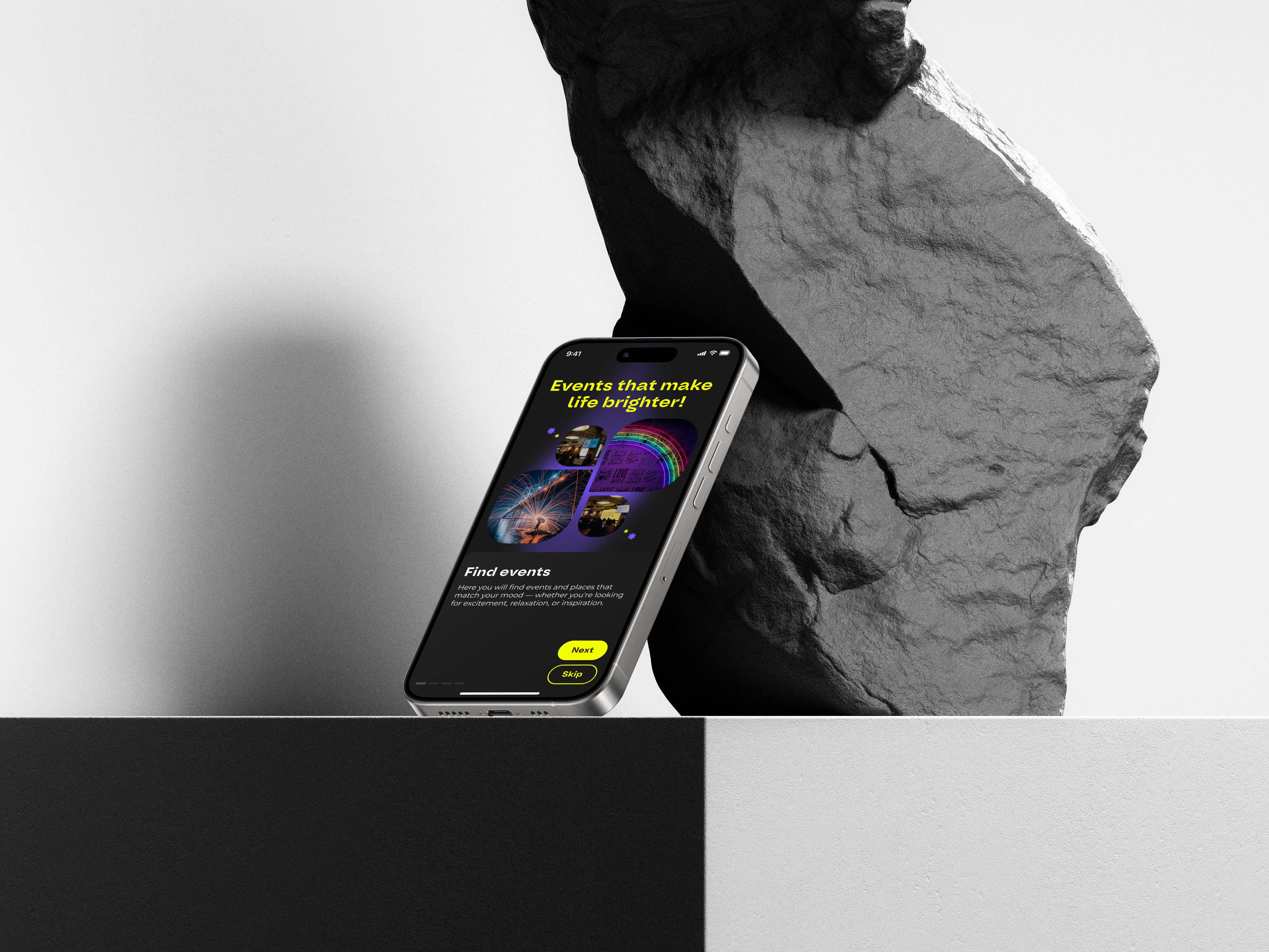
No existing product or data — the app concept was built from scratch with no prior user base or analytics
Overcrowded app market with visually similar event platforms
No established design identity or brand voice
Users often feel overwhelmed when browsing large event listings with limited filtering options
Mobile-first behaviors (fast decisions, low attention span) not considered in typical event apps
Conducted competitor and UX research to identify patterns and user pain points in nightlife and event discovery apps
Built user personas and journey maps to define motivations and improve feature prioritization
Designed a clear, bold, and energetic visual identity tailored to a young, urban target audience
Developed intuitive navigation and filtering logic to simplify event exploration and ticket booking
Created high-fidelity mobile prototypes and interactive flows to simulate real experience
Focused on mobile-optimized UI and microinteractions to keep users engaged and reduce friction
research & analysis.
User interviews – to explore users’ expectations, frustrations, and motivations
Competitor analysis – to identify market gaps and best practices
Persona creation – to keep the team aligned on who we are designing for
Customer journey mapping – to identify friction points across the user flow
Usability testing (remote) – to validate designs and uncover usability issues

ui design.
The sign-in and registration process in Vibely is quick and seamless, allowing users to sign up via email, phone number, Google, or Facebook account.

Introduces the app’s features and helps personalize recommendations by letting users select their interests. This ensures a tailored event search experience from the very first use.

Serves as a central hub for navigation, where users can instantly explore event collections, trending activities, stories, and personalized recommendations. Its intuitive interface provides quick access to search, maps, and tickets, while dynamically updated content ensures users always discover the most relevant events in real time.
Allows users to quickly find interesting events using convenient filters and categories. The "Go Anywhere" feature enables users to randomly select an event. The interactive search adapts to queries, while the event list displays key information—name, date, location, and ticket price—helping users make decisions in seconds.

Provides all essential details: images, description, date, time, location, ticket prices, and available payment options. Users can also check reviews and discover similar events.
Is quick and seamless, offering multiple payment methods with instant confirmation. In just a few taps, users can book their spot and receive an e-ticket, making event attendance effortless.

Is a personalized space where users can manage their interests and past bookings. It also allows them to customize preferences for more accurate event recommendations.
Is a section where all purchased and saved tickets are stored, providing quick access to QR codes for entry and event details. Users can track upcoming events and receive reminders to ensure they don’t miss anything.

results & impact.
The initial idea came from the client, and I was responsible for research and design. While we had a working concept and engaged developers, the app was never launched due to challenges in securing sponsors. Instead of letting the work fade away, I decided to refine and complete the design as a standalone case study — to reflect the full process and my contribution. Sometimes, the launch doesn't happen — but the learning and growth definitely do.

